Tuesday, September 9, 2008

'55 Chevrolet Newspaper Ad

                   CHEVROLET'S SPECIAL HILL-FLATTENERS ! 162 HP V8   180 HP V8
This illustration by Charles Allen was among the first newspaper ads produced using the line technique that would make Chevy ads famous. Many of the newspaper ads from this time were produced with photography which was the latest thing in advertising. But when the reproduction results were reviewed by gathering tear sheets from all over the country they left much to be desired. Newspaper printing presses were nothing like those being used today. They tended to wobble some and the ink distribution was usually too heavy or too light resulting in a very unsatisfactory look at the product. The line technique Jim Hastings began using for newspaper ads came from his experience when he was with the Paterson and Hall art studio in San Francisco. Hastings himself had made illustrations using the technique and knew first hand the quality that could be produced. His other contribution to Chevy ads of the future was the relationship with America and the endless highways that would appear in ads yet to come.   The double perspective for highway performance illustrations allowed for great views of the cars and great views of the roads they traveled.

'55 Chevrolet Magazine Ad

IT'S MAKING '55 FAMOUS ---FOR FUN!
This illustration by Fred Ludekins shows one of the lower priced Chevrolets. Still the sub head copy says that Chevrolet is stealing the thunder from the higher priced cars. And they were doing exactly that at the time. The new Chevy styling and new V8 engine were very popular. The story played to what has always been the Chevrolet advantage--more car for the money. Fred Ludekins didn't do many more illustrations after this one and I am not sure why. It is interesting to notice the Chevy police car with the officer waving to his friend in the Chevy convertible. 

Wednesday, August 6, 2008

'55 Chevrolet Newspaper Ad

"OLD RELIABLE " INTO A FLASH OF FIRE !
Doug MacIntosh was the art director on this ad and Warren Winstanley was the photographer. At the time Warren worked for Cle Clark who was one of the pioneer car photographers in Detroit. Mickey McGuire also worked for Cle Clark and would go on to establish Boulevard Photographic with Jimmy Northmore. Jim Hastings was the agency head art director at the time and was in the process of creating an art style for Chevy that would last for years. Why this ad and several others were illustrated with photography rather than art I do not know as I didn't start at Campbell- Ewald until Jan. of 1958. My guess is that Doug MacIntosh was pushing for photography and was one of the best art directors Hastings had at the time. Doug was helpful in getting me an interview with Jim Hastings. We had worked together at Kenyon and Eckhardt on the Lincoln - Mercury business. Chevrolet really had in all going with the great looks and hot performance of this new car. This headline said it all.

Thursday, July 31, 2008

1955 Chevrolet Magazine Ad

HOW TO LOOK YOUR BEST WHEN EVERYBODY'S LOOKING
The '55 Chevy styling was really something special. It was a tremendous departure from anything Chevrolet had offered. And with the big new V8 engines it was a home run. This wonderful illustration was by Bruce Bomberger. Bruce was one of several outstanding illustrators from California that Jim Hastings knew and used to bring a new vitality to Chevrolet print advertising.

Wednesday, July 9, 2008

'56 Chevrolet Magazine Ad

IT'S A BEAUTIFUL THING TO HANDLE !
And look a little closer and you will see just a touch of a Corvette. Then too you might wonder why a performance and handling story like this didn't  have an illustration with the car in one of those wide open road illustrations Chevy was noted for. But then the boat carrying the car was perhaps a beautiful thing to handle too. This illustration was by Mel Brindle who was paid $2,500 for the effort. The ad ran in the July issues of Holiday,Time,Outdoor Life, Saturday Evening Post, and Field and Stream. It was in color but I do not have a color example to show you.

Saturday, June 28, 2008

'56 Chevrolet Newspaper Ad

GIVE IT AN INCH AND WATCH IT TAKE THE MILES !
I am not sure about the artist on this one. It most likely was by one of the California guys Jim Hastings was using during this time. The signs say the car is in the eastern part of the country but that does not mean the illustrator was not on the west coast.
Still, the artists Hastings was using from there usually signed their work and this is not signed so it could have been done by a Detroit illustrator. Hastings was bringing along some of the local talent and getting good results.

'56 Chevrolet Newspaper Ad

IF YOU HEAR A THUMP...IT'S ONLY YOUR HEART !
Illustration by Charles Allen. He was with the Patterson and Hall studio in San Francisco at the time as were several other artists that did illustrations for Chevrolet. Among those were Stan Galli, Bruce Bomberger, and Hains Hall. What a collection of talent in one place. Jim Hastings, my boss at Campbell-Ewald, worked at Patterson and Hall as an illustrator before he was hired by C-E to be the head art guy. That explains the reason so many illustrations from this time were done by illustrators from San Francisco. If Jim Hastings was not the actual art director for this ad he most certainly approved the layout before it went to the Chevy client and was the one that sent it to Patterson and Hall for the finished art.

Friday, May 23, 2008

'56 Chevrolet Corvette Magazine Ad

PEBBLE BEACH
The 1956 Corvette is proving--in open competition--that it is America's only genuine production sports car. The first sentence in this said it all but then went on to tell about all the good stuff you could get to own a car that could race or one that could compete with the Ford Thunderbird as a personal luxury car. The photo is one that was actually taken at the race and the art director was probably Doug MacIntosh. Doug had been a proponent of photography for the regular Chevy and most likely argued that photography was the only way to go for an ad like this. And he was right. The copy was getting very close to the theme that would last for years--America's only true sports car. Barney Clark was probably the copy writer. This ad appeared in the August issues of Hot Rod, Motor Life, and Motor Trend.

Tuesday, May 13, 2008

'56 Chevrolet Corvette Magazine Ad

CORVETTE SIZZLES WITH A NEW HOT V-8 ! (that any Chevy dealer can service)
Sports cars of the day were a little expensive to service. Still true today. But, then as now you could get your sports car serviced at any Chevrolet dealer. And there were a bunch of them. Corvette was well on the way to becoming Americas only true sports car but the ads had yet to make the claim. This ad ran in Car Life, Hot Rod, Motor Life, Motor Trend, Road and Track, and Motor Sport all in May of 1956.

'56 Chevrolet Corvette Magazine Ad

LOVE SEAT YOU'LL NEVER WANT TO LEAVE !
It is kind of hard for me to understand how this ad came about. It doesn't seem like the kind of thing Barney Clark would have written and I know David E. Davis couldn't have had anything to do with it. Corvette had a bigger engine with more performance stuff and was even doing a little racing. The only thing I can think of is somebody thought there was a need to be more competitive with the Ford Thunderbird. They were both two-seaters but the T-Bird was more luxurious and had an appeal different from the Corvette.It was more of a personal car than a sports car and Corvette was going the way of the pure sports car. It is hard to imagine the T-Bird going racing. Anyhow, the ad was done and ran in the May 19, issue of New Yorker and the May 14, issue of Sports Illustrated. Nothing wrong with having an animal in the passenger seat. I did an ad a few years later with a very big dog along as the passenger but the car was really moving and David E. Davis Jr. wrote a great headline that said "More kicks than a sack full of jack rabbits."

Friday, May 9, 2008

'56 Chevrolet Newspaper Ad


SEEN ONLY ON HIGHER PRICED CARS AND CHEVROLET
The meaningful emblem of Body by Fisher
A nifty way to relate to all the other GM higher priced cars and still stay true to Chevrolet's value position. Body by Fisher was very important to Chevy and all of GM back then. Fisher Body even ran some advertising. There was also an annual contest for young people to build a coach in the image of the logo. All the entries were displayed and judged in the lobby of the GM building on West Grand Boulevard in Detroit. The coaches all looked pretty much alike to me but the judges always came up with a winner. There was some some scholarship money for first, second, and third place as I recall. Later the contest was changed. Rather than build a model coach the young people were to design and build a model car. This was an even better contest and more related to GM products. Mac Namara Studio produced the art for this ad. They were located in the Penobscot Building in Detroit. Two brothers owned and operated the studio-Emit and Jack Mac Namara.

'56 Chevrolet Newspaper Ad

THE "PASSWORD" IS CHEVROLET!
This is an interesting illustration in two parts. It was a concept used often in Chevy ads and almost always to show performance. There were a lot of two lane highways back then and the Chevy 225-V8 engine made for safer passing. Notice all the little things that make the illustration successful--the car has moved past the truck in very short order and the oncoming car in the distance has hardly moved down the hill. The cow nearest the viewer has raised its head but not moved. Fun stuff. This illustration was by Bill Fleming of the La Drier Studio in Detroit. Local artists and studios were beginning to understand what Jim Hastings was trying to do.

'56 Chevrolet Newspaper Ad

HOLDS THE ROAD LIKE IT LOVES IT (and Chevy does!)
Drivability and performance were always near the top of Chevrolet ad priorities. Chevy had a record-breaking performance on Pikes Peak and was doing just fine at Daytona. The view on the car taken here nearly hides the face that it is a 4-door sedan. Back then they sold pretty well but the hard-tops and convertibles were the glamor cars. This illustration is by Haines Hall. Haines was part owner of a San Francisco studio named Patterson and Hall where Jim Hastings once worked before joining Campbell-Ewald. The studio still exists today but is more like an ad agency than an art studio. They do very good work that can be seen on their web site. They call themselves P&H Creative Group and you can see what they do at www.phcreative.com--a very nice fellow named Bruce Hettema runs the place now.

Thursday, May 8, 2008

'56 Chevrolet Newspaper Ad

CHEVROLET PUTS HILLS BEHIND YOU AND PLEASURE AHEAD !
This is a newspaper version of the magazine ad directly below. The magazine ad was done first and ran in May while the newspaper ad ran in July. The magazine ad was by Fred Ludekins and this newspaper version was produced by Bruce Bomberger. The reason for two artists was that Ludekins was not particularly good at the line illustration needed for newspaper reproduction. This was true for other great illustrators like Austin Briggs and takes nothing away from them. Jim Hastings knew exactly what he wanted and how best to get it. The two illustrations are very similar and Bomberger most likely used the same drawing for the car and people. There are some interesting differences. The license plate is gone on this version and the background has been condensed to fit a vertical format. The ladies dress takes on a vertical pattern and the guy now has black hair with his hand gone from the roof. Lots of other small things too. Not much research was done on ads back then but when a client liked an ad the agency was ready to run it in magazines and newspapers. 

'56 Chevrolet Magazine Ad

CHEVROLET PUTS HILLS BEHIND YOU AND PLEASURE AHEAD !
This ad was in color but I do not have a color version at this time. Still, a very nice illustration by Fred Ludekins. It ran in the May issues of Saturday Evening Post, Life, and Look magazines. I'll bet the information on the signs is correct. With the kind of exposure these ads got fake information would have generated considerable mail.

Wednesday, April 30, 2008

'56 Chevrolet Newspaper Ad

WHY PEOPLE WHO USED TO BUY HIGHER PRICED CARS ARE CHANGING TO CHEVROLET
Chevrolet has always offered more car for the money. Back then as well as now you really don't get much more when you spend more for a higher priced car. And looking at another way --if you have one of these Chevrolets now it is worth lots more than most other cars that cost a bunch more back in 1956. Real value! The art for this ad was by Paul Nonnast and he got all of $1,500 for his effort. Look at the airplane about to land at LAX. It is not a jet but a four engine prop driven Constellation. A really great plane at that time.

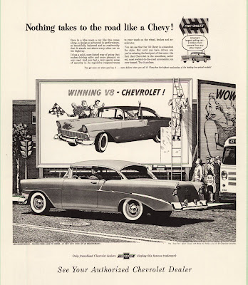
'56 Chevrolet Newspaper Ad

NOTHING TAKES TO THE ROAD LIKE A CHEVY !
This is a terrific illustration by Bruce Bomberger and a terrific idea for an ad, probably by Jim Hastings. The thing that makes it so nifty is that the outdoor board the guy on the ladder is putting up is an actual board timed to be up all over America when this ad ran in newspapers all over America. The young lady on the adjoining board with the word "WOW" is a nice touch too. It was ads like this supporting the great cars Chevy was offering that helped make Chevrolet America's favorite.

Saturday, April 26, 2008

'56 Chevrolet Newspaper Ad

NOBODY SPARED THE HORSES IN THE '56 CHEVROLET !
This is another illustration by Bruce Bomberger. He was in California as were most of the artists Jim Hastings was using at the time. Hastings had been hired by Ted Little the new Chairman of Campbell-Ewald and was in the process of bringing a new look to Chevy advertising. Most of the artists that could make the kind of illustrations he wanted lived in the San Francisco area near where he had come from. It would take time for Detroit artists to understand the specific kind of thing he wanted. This ad also ran as a Sunday Supplement ad but with a different headline. The street car is in San Francisco as were many of the Chevy illustrations of this time. Sometimes the little things contribute greatly to the success of an illustration. In this case notice the forward slant of the wheels. It gives the car a feeling of motion. 

Monday, April 21, 2008

'56 Corvette and Chevy Newspaper Ad

TWO CHAMPIONS OF THE ROAD...BOTH CHEVROLETS!
Back then Chevrolet had only one line of cars and Corvette so Corvette often got attention in ads for the regular car. The Corvette had been given a strong mechanical upgrade and the styling was some of the best ever. Today Corvette almost never gets to be in ads with other Chevrolets. This art was produced by Paul Nonnast. He was paid $1,500.00 for the art. Not much in todays dollars but important money back then.  

'56 Chevrolet Newspaper Ad

MORE CHICKENS CROSS THE ROAD IN FRONT OF CHEVROLETS THAN ANY OTHER CAR. 
This leadership ad for newspapers was done by Bill Tara. Bill did the art for the chickens but probably not the car. The whole ad was most likely his idea as he was part of an outside group from the west coast that contributed regularly to the Chevy ad effort. Several years later he was the art director for the first series of photographic ads for magazines. A very nice way to tell the story of Chevy leadership without sounding boastful. 

'56 Chevrolet Leadership Magazine Ad

MORE PEOPLE NAMED JONES OWN CHEVROLETS THAN ANY OTHER CAR !
(Are you keeping up with the Joneses ! )
Chevrolet loved to run ads that claimed leadership and this was one of the very best. Too often claims of leadership are that and nothing more but this is done in such a disarming way it leaves you with a nice warm feeling for Chevy. The art is by Austin Briggs and is beautifully done. This ad ran in the September issues of many national magazines. Austin Briggs got $2,500.oo for the art. Imagine that.

Sunday, April 13, 2008

'56 Chevrolet Convertible Magazine Ad

QUEEN OF THE SHOW....AND THE ROAD !
The on going theme for this year was " The hot one's even hotter". And it certainly was hot back then. Sales were great and the car was great. The new small block engine was great too. Kind of a neat little dig at the competition if you think they may be represented by the young ladies that didn't win the beauty contest. Chevrolet always loved to promote their leadership even if it was in a scuttle way. This fine illustration was by Bruce Bomburger. Bet you wish you had one of these cars today.

'56 Chevrolet Station Wagon Magazine Ad

SEATS A WHOLE BASEBALL TEAM BEAUTIFULLY !
What a nice and strong way to tell a seating story. No background but no need for a background in the illustration. Has all the warmth and feeling for America that Chevy was becoming known for. It would be quite a few years before baseball would become the theme for perhaps the most famous car commercial of all time. I think this illustration may have been by Charles Allen. A nine passenger wagon that looked this good and had a Chevrolet price was something pretty special back then and if you have one now it is still pretty special and worth a ton.

Monday, April 7, 2008

'56 Chevrolet Magazine Ad

YOUTH, BEAUTY, CHEVROLET, ACTION !
Austin Briggs did this illustration. During this period he was at the top of his form and it shows here. I don't know who had this idea for a Chevy ad but it is a beauty and not the kind of situation that easily comes to mind. In '56 Chevy was the "Hot One" that was even "Hotter" and this played to the idea that it was a hot seller as well as a hot performer. This kind of story telling illustration for advertising has all but disappeared especially for car ads. It may be that computers have something to do with it. It's much easier to do some kind of abstract background and tack on a headline. Too bad illustrators are out of style and no longer play an important part in ads today. Some great artists are still out there but they are painting for themselves. A good example is Jim Dietz. He paints wonderful war situations with lots of emphasis on people. I bought one of his paintings a few years ago. He is as good as any of the illustrators from the '50s and better than some. Charley Schridde is an illustrator from back then that is still painting and doing very well at selling stuff. Harry Borgman is still around too. And there is a whole school of artists illustrating the Civil War. The capability is out there just waiting for someone to figure out how to use it. You can check out all these artists on the internet.

'56 Chevrolet Magazine Ad

NOTHING WITHOUT WINGS CLIMBS LIKE A '56 CHEVROLET !
This is a really fine illustration by Bruce Bomburger. I especially like the way the car leans slightly forward giving more of a feeling of speed. Look at the wheels and notice the forward leaning ovals used to show them. Bruce didn't invent this illustration device but kind of lifted it from older illustrations that did the same thing usually in race car situations. It is very much in keeping with what the ad is saying in the headline. This was the year the "Hot One" got even "Hotter". Jim Hastings, the top art director, was using several west coast artists at this time and they almost always showed far west backgrounds in the illustrations.

Wednesday, April 2, 2008

'70 Chevelle SS 396 Magazine Ad

CHEVELLE SS 396. OTHER CARS WISH WE'D KEEP IT THIS WAY. 
This was quite a car with the big 396 engine and I thought this would be a great way to show how powerful it really was. We were on an "experimental shoot" in California. Chevrolet gave us the new prototype cars to photograph without any layout approval. We took two creative teams--I was one along with Bill Graefen for copy and Warren Winstanley for photography. Tony Longo was the other art director I took along and he had Jim Hartzell for copy and Dennis Gripentrog for photography. I insisted we have as many ideas for photographs as possible before the shoot began. That was important because we had a lot of expense going on with the two crews, the guys from Chevrolet with the vans full of cars, and a whole bunch of account guys that were responsible for the security. This was one of a bunch of ideas I had sketched out on letter size yellow pads. They were not layouts but in this case a box like car with ropes around it. Warren had one of his assistants go to the shipping docks and buy the biggest rope he could find. We fashioned the stakes from fence posts and looped the rope through the car, Then we messed up the earth behind the rear wheels to make it look like the car was trying to get away. That doesn't show very well but it doesn't matter. Two views were made, this one and one from dead ahead. The other view was used in some promotion material. I have seen this ad in most every book that deals with Muscle Cars or high performance cars from this time. You can buy a beautiful copy of this picture as well as the front view from the General Motors site. Go to Chevrolet and then to photos of Chevelle. I don't have some of the other pictures with me but there are several more done this way. One was done on the Screen Gems Lot with a very big bright red light hidden under the hood and glowing down on to the pavement even though it was parked in a neighborhood. Also available from GM. Another had a guy as the driver that looked like a WW One fighter pilot and on the door just below the drivers window were a bunch of cut outs pasted like planes shot down. There were several Mustangs (the horse not the car), the Plymouth Barracuda (again not the car), and a few Cobras. I made the stickers before we left Detroit. It made a terrific picture but I couldn't get it sold. Still have a print of it and I'll show it to you when I get back to Michigan. Dick Wingerson wrote the copy for this ad. Thanks for the correction, Dick.            

'70 Corvette Magazine Ad-Art By Ken Dallison

"70 CORVETTE. WHAT ELSE.
Ken Dallison gives his illustrations a different look. A little looser than most artists and no pretense of being photographic. It brought a nice fresh look to this ad. Ken worked in a different way too. If he didn't like the look of, lets say the wheel area, he would simply cut it out and do it over again and glue it in place. He didn't do it often because he nearly always did it right the first time. Ken is still working today doing both commercial and fine art. I think the copy here was by Dick Wingerson and the art direction by Bob Forlenza or Don Gould.

Saturday, March 29, 2008

'57 Corvette Magazine Ad

" UND SO HELP ME MIR, HERMANN, I WAS HOLDING 5900 R.P.M. AND HE CAME PAST ME LIKE A STUKA....AND PLAYING THE RADIO, TOO !"
What a nice ad this is. Kind of gets us into racing without really doing it. Corvette did get to go racing but not in the ads at this time. This car really did make Corvette, Americas only true sports car. The copy was by Barney Clark and the art direction probably by Bob Hungerford. Todd Wright was probably the photographer and it was most likely shot in California. The fuel injection option made ads like this possible. If you can find a March 23, 1957 copy of New Yorker or a March 11, 1957 copy of Sports Illustrated you can get a copy of this ad or the next time you are at a car show visit the guy selling old car ads.

'57 Corvette Magazine Ad

"FANTASTICO ! EVEN IN TURIN NO ONE HAS FUEL INJECTION !"
And that was right. Fuel injection turned Corvette onto a real sports car. The '57 Corvette today is one of the most expensive older cars out there. Especially if it has the fuel injection option. I had my first ride in our chairman Ted Little's all black one. I got the car for the weekend and what a thrill it was. No 4-speed and no injection but a Corvette. I have always thought the '57 was one of the best looking of all Corvettes. It even stands up well to todays car. I was a little disappointed in '58 when the duel headlights were added. But that was what everybody was doing then. This ad was written by Barney Clark and the art director may have been Bob Hungerford. This ad ran in Sports Illustrated on May 6, 1957 and probably the May issue of New Yorker. 

'57 Chevrolet Magazine Ad

'57 CHEVROLET ! SWEET, SMOOTH AND SASSY !
This was the announcement magazine ad for one of the greatest cars Chevy ever produced. You can think about it that way if you consider what one of these is worth today. What happened along the way to make this particular Chevy so desirable over 50 years later ? It was very popular back then but if I am not mistaken it lost the sales race to Ford for the first time in years. Not by much but a loss none the less. Who knows about that for sure ? Anyone out there that can confirm that or maybe correct it ? I wish I still had my '57 Bel Air Hardtop and if you had one I'll bet you do too. Even the ads torn from old magazines are worth quite a bit. How about that ? Dave Lindsey may have done the art and Pete Booth may have done the copy.

1962 Chevrolet and Harry Borgman


This is a page from a self promotion piece Harry did for himself some time ago. The interest for us is his illustrations for the '62 Chevy. The convertible on the left is for a newspaper ad and the coupe illustration next to it is for a magazine ad. The others are for various other assignments he received around this time. Harry is one of the most versatile artists ever to pass through Campbell-Ewald, Chevrolets ad agency. He continues to work today and is doing commercial art as well as fine art. He has written many books on art and how to do it, among others. Harry's latest art adventure is with his computer. He sent me his latest book Digital Dreams--Exploring the computer as an art medium. It is beautifully done and I recommend it for anyone that may want to do more with a computer. Even if you don't want to do more you will enjoy seeing what an artist that did Chevy ads back in the '50s and '60s can do with something that didn't exist then. And, if you have a friend that fancies himself or herself an artist you will put them in your debt forever by giving them Harry's book Art Therapy--the funny world of art. It is a treasure of many of the things Harry must have experienced as an artist. We are lucky to have Harry and a few others still with us. Art the way it was done back in the '50s and '60s is pretty much gone forever. But, if called upon for something like that I'll bet Harry would be pleased to supply it. For his books and a look at all he is doing go to harryborgman.com

Friday, March 28, 2008

1957 Chevrolet and Harry Borgman

Harry Borgman was my first boss at Campbell-Ewald. He was the head art director in the sales promotion group in 1957 and he and his assistant Paul Sameulson did all the Chevrolet sales promotion material. That included the catalogs for Chevrolet and Corvette that you see here in a visual history Harry put together as a self promotion piece. He also did the promotion for Dinah along with all the direct mail and zillions of other things Chevrolet required in 1957. There was so much stuff that a fellow named Tom Clark and I joined him at the beginning of 1958. Harry is a remarkable guy that has had a remarkable carrier in the art business. He is still active and is working for both fun and profit. When he left the sales promotion group he became the head art director for all Chevrolet magazine ads. After that, and all you Corvair enthusiasts will enjoy this, Harry left the agency to devote his efforts to illustration but was secretly re-hired to develop the announcement ad program for the introduction of the Corvair. He was hidden away in special office away from the agency and there did the first Corvair ads. It was all so secret that when he ordered type he ordered it from two or three type setters each getting only a portion of a headline. Then he assembled it so the headline made sense. If you have some of the first Corvair ads you have some of Harry's work. But Harry was just getting started in the art world. He did newspaper illustrations for Chevrolet and others as well as magazine and catalog illustrations. Then it was off to Paris, France where he did illustrations for all the major ad agencies and devoted the time not needed for commercial work to painting. He was there for six years and exhibited his work in the major galleries of Paris. Back in New York he was doing illustrations for the big ad agencies and exhibiting his paintings and sculpture in some of the best galleries. During this time and a little later he managed to publish more than a dozen books. Most are out of print now but he has two new ones in print. One is Digital Dreams-Exploring the computer as an art medium. If you have an interest in art and own a computer, you will want this book. If you have an interest in art, or even if you don't, you'll enjoy Harry's other book now for sale---Art Therapy-the funny world art. You can order both of these books at Harry's site harryborgman.com

Wednesday, March 26, 2008

1957 Chevrolet Full Line Catalog

This catalog was designed by my first boss at Campbell-Ewald, Chevrolet's ad agency, Harry Borgman. Harry is still very much alive and working. When this catalog was produced the car industry wasn't spending much on this kind of thing. By todays standard this is a pretty small book. The paper is not nearly as good as that being used today and I am sure the printing wasn't as good. Still if you have one of these I'll bet it is worth a bunch. I haven't seen one for sale in a very long time. Catalogs were always started long before any advertising had been decided upon and were close to going to the printer when ads were finalized. There was considerable lead time involved because of the tremendous number of books involved. It took a train load of paper to print one of these. Remember there were about 6000 or so dealers and each one needed a good supply to give away. Sometimes the art from the catalog would be used in an ad but for the most part the catalog art was to simply show what the car looked like and what colors it came in. 
If you came to this post first be sure to check the information about Harry Borgman. It should be right above this.

'57 Chevrolet Outdoor Poster

MORE TO BE PROUD OF ! CHEVROLET
What a great illustration by California artist Charles Allen. And look--the people are in front of the car. I wonder how that got through. The car looks wonderful and the message is right on. Anybody that has one of these now feels very proud indeed. This is the kind of advertising that helped Chevy become America's car.

'57 Chevrolet Outdoor Poster

AMERICA'S STUCK ON CHEVY...CHEVY...CHEVY...CH
Chevrolet always liked to remind America of the leadership position it enjoyed and ads like this did it in a very charming and memorable way. The original color was much better than this old slide shows.

'57 Chevrolet Magazine Ad

MOUNTAINS AND MILES ARE A BREEZ IN A CHEVY !
Another fine example of Chevy moving right along with some other craft--in this case a very fast speed boat. I wish I had a count on the number of times this was done. The checkered flags with the logo tells us that Chevy has been racing and doing very well. A nice reminder. In many of the ads you will see a reference to Chevrolet being No 1 USA. 

'57 Chevrolet Magazine Ad

VELVET SMOOTH AND FULL OF SPUNK !
I don't know who did this illustration but it has all the warmth and feeling for America and the good life that are in most Chevy ads. Notice the type face. It is not a standard face but one designed just for Chevrolet ads. As you look at the ads from this time and a little later you will see the type is nearly always the same. Another feather in a cap covered with feathers for Jim Hastings. It is very hard to keep a bunch of very creative people on the same track and using the same type but Jim did it. 

'57 Corvette and Chevrolet Magazine Ad

SWEET (Just look) SMOOTH (Ah, that Turboglide) SASSY (Just drive it !)
This was a later version of the announcement ad with a similar headline. Also, the Corvette gets major attention and as a Sports Car in a real race. The Corvette was dramatically improved with new fuel-injection. I think the fuel-injection may have been offered in the Bel Air too. The art was probably done by one of the west coast artists that were doing much of the work at this time. Boy, a convertible like this one would be worth all the money in the world today. I am so pleased that old cars of all makes are being restored and enjoyed all over again. Every model of the '57 Chevy is a collectable car. Nobody back then would have guessed that this Chevy would become so heroic. The '58 Chevy was just around the corner and it was an all new car.

Tuesday, March 25, 2008

'57 Chevrolet Newspaper Ad

SPUNK TO SPARE !
A newspaper ad with the car not out on the American open road but on a bridge. The emphasis in some way is usually on the great performance you got from the new Chevy Small Block V8. If you look closely you will see a Corvette just to the left of the Chevy. This was a time when Chevrolet offered only the regular Chevies and the Corvette so the Corvette often got into the illustrations. I have no idea who did the art but it does not look like any of the west coast guys.

'57 Chevy Goes Racing Newspaper Ad

CHEVIES SWEEP GRAND NATIONAL 100 MILER   
1- 2- 3 AGAIN !
Chevrolet has always been interested in racing but sometimes other considerations prevented them from doing what they wanted to do. Not the case in 1957. One thing you may notice is that even though this is a newspaper ad photography is used rather than the very successful art. In this case art could not have delivered the same reality as a photo. This was more of a news event being reported and it was not important that the car look it's best. It was what it had lust done that was most important. Doug MacIntosh was the art director. I especially like the crossed flags with the Chevy logo--a real nice touch.

'57 Chevrolet Newspaper Ad--Wins At Daytona

CHEVY TOPS ALL CARS AT DAYTONA -- OFFICIALLY !
Yes, Chevy has been at Daytona for a very long time and was winning back then too. The cars at Daytona in 1957 were nothing like the ones that go there now but it was fun and exciting. Another dimension of Chevrolet that helped make it The Heartbeat of America. I am pretty sure the art director for this ad was Doug MacIntosh. Doug and I worked together at Kenyon and Eckhardt on the Lincoln- Mercury account a few years prior to this and he put in a good word for me with Jim Hastings who was the top art guy at Campbell-Ewald. 

'57 Chevrolet Newspaper Ad

CHEVROLET PUTS THE NICEST THINGS TOGETHER... and in the nicest way !
Whoever had this idea for a Chevy ad may have put their finger on some of the elements that have made the 1957 Chevrolet one of the most collectable cars in America. The '55 and '56 cars are very popular too but not like the '57. Why has this car become so important to Americans ? At auction a first rate convertible can bring way over $100,000. I saw an ad that offered a complete '57 convertible body new and ready to be assembled from available parts into a car. No need to restore one anymore.

'57 Chevrolet Newspaper Ad

CHEVROLET'S GOT A CORNER ON THESE FINE THINGS !
Another fine illustration for Chevy by a west coast artist. I am not sure which one but it is hard to imagine a Detroit artist doing a road like this. The Detroit guys didn't have the understanding of what the really big mountains looked like. Jim Hastings had developed several artists on the west coast that could do this kind of illustration. Among those were Charles Allen, Bruce Bomburger, Stan Galli, and Gordon Brustar. Fred Ludekins did some Chevrolet illustrations too but not for newspapers as far as I know.

'57 Chevrolet Newspaper Ad

NO DEAD WEIGHT TO MAKE IT DRAG ITS FEET !
The art for this Chevy ad was produced by Charles Allen. He and several other west coast artists were doing much of the newspaper ad art for Jim Hastings. Jim was the one that developed this art style for use in Chevy newspaper ads. He was a very good artist and could do illustrations like this himself. The reason he didn't do any art was that there was way too much to be done for him to be tied up doing one illustration.  

'57 Chevrolet Newspaper Ad

CLINGS TO THE ROAD LIKE A STRIPE OF PAINT !
This has to be one of the steepest roads you have ever seen. Neat turns too. The art was done by Charles Allen. He was doing a considerable amount of work for Chevy at the time and illustrations like this show why. Not only is the art done in line as all newspaper art was then but the composition is great. He lived on the west coast and I have often wondered how Jim Hastings got such fine work from artists so far away.

Monday, March 24, 2008

'57 Chevrolet Newspaper Ad

YOU GET BETTER LOOKING IN A '57 CHEVROLET !
When is the last time you saw an instrument panel as the main illustration in a car ad ? I remember this view from behind the wheel of my '57 Bel Air. When I got mine the '58s had just come out but I had been wanting a Chevy like this since I had started work at C-E. I had been driving a '54 Studebaker coupe that I bought when I worked at Benton and Bowles, the Studebaker agency. It was a car I should have kept too. The Raymond Loewy coupe is still a great looking car today and hard to find if you want one. The Chevy I got came through Chevrolet and had been driven by an executive. The price was right and the color was perfect. I bet everybody that ever owned one of these wishes they still had it . They are worth a ton now in any kind of condition.

'57 Chevrolet Newspaper Ad

IT GIVES YOU MORE TO BE PROUD OF !
What a great looking car. And what a nice ad. It has that little bit of Chevy warmth that had become so important to the image being built. Chevrolet was well on the way to becoming America's car, and this kind of thing along with the open road illustrations was paving the way. Dinah Shore singing about Chevy was working too. Lots to be proud of.
Jim Hastings did many things to make the Chevy advertising consistent. One that goes pretty much unnoticed is the typography. The headlines were made from a type face developed just for Chevrolet and you can see it used in nearly all the ads from this time.

'57 Chevrolet Magazine Ad

SMOOTH AS QUICKSILVER... and quick as they come... the '57 Chevrolet
This was the time of art illustration for nearly everything being advertised. Photography was just beginning to be a factor. Film at the time was nothing like it is today and I don't mean it was about to disappear as it is now. It was very slow and you needed strong light to get acceptable results. Young art directors wanted to use it because it was new and offered realism and variety. Still, when I look back at this stuff I think we have lost something. Not that todays ads are not doing the job but these ads have a lasting value that much of todays ads may not have. I like to think of things like this as being kind of like what Norman Rockwell did for magazine covers. They should be saved for what they represented to everyday viewers back then. 

'57 Chevrolet Magazine Ad

FULL OF SPUNK....
A really delightful piece of Chevy art. When you think about what these cars are worth today it kind of it makes you wish you had saved yours. I had one this color but the hardtop version. It got totaled on Telegraph Road one evening when I was turning to drop off a fellow worker. I had stopped in the left turn lane with the blinker on when another car didn't see me, pulled out to pass and hit the rear with great impact. A fellow in the back seat had his shoulder broken and I bent the steering wheel nearly in half. It was a great Chevy and I loved it. 
Gordon Brustar was the artist for this ad. He was on the West Coast as were several other artists that Jim Hastings liked to use. It is rare to see such a string of outstanding illustrations for an advertiser and much of the credit goes to Jim Hastings. It wasn't long until he developed artists in Detroit that could do similar things.

'57 Chevrolet Magazine Ad

IT LIKES TO FLEX THOSE BIG NEW MUSCLES !
There is an ad below that is like this but prepared for newspaper reproduction. Jim Hastings may have been the art director but if not he had a lot to do with the way it turned out. Notice the moving train that is similar to moving things in most Chevy ads done at this time. Sometimes the moving thing was a plane or boat near the Chevy. This concept for Chevy art was most likely the direction of Hastings. He was the head art guy at the time. I heard Jim tell about this ad on several occasions. The original idea and art had a steam locomotive in the picture with smoke streaming back to give the feeling of motion. When the art was going through the approval process someone decided that since General Motors made locomotives there should be a GM Diesel in the picture rather than the steam engine. This was changed as directed but those that decide such things thought the engine as presented was not a GM engine. So this ad had to go to the General Motors Diesel Locomotive Division for final approval. Sometimes one wonders how so many good ads made it through all the sieves.