Wednesday, April 30, 2008

'56 Chevrolet Newspaper Ad

WHY PEOPLE WHO USED TO BUY HIGHER PRICED CARS ARE CHANGING TO CHEVROLET
Chevrolet has always offered more car for the money. Back then as well as now you really don't get much more when you spend more for a higher priced car. And looking at another way --if you have one of these Chevrolets now it is worth lots more than most other cars that cost a bunch more back in 1956. Real value! The art for this ad was by Paul Nonnast and he got all of $1,500 for his effort. Look at the airplane about to land at LAX. It is not a jet but a four engine prop driven Constellation. A really great plane at that time.

'56 Chevrolet Newspaper Ad

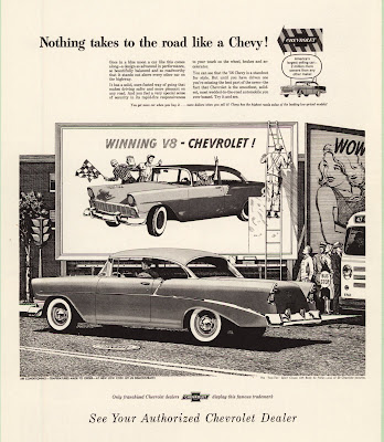
NOTHING TAKES TO THE ROAD LIKE A CHEVY !
This is a terrific illustration by Bruce Bomberger and a terrific idea for an ad, probably by Jim Hastings. The thing that makes it so nifty is that the outdoor board the guy on the ladder is putting up is an actual board timed to be up all over America when this ad ran in newspapers all over America. The young lady on the adjoining board with the word "WOW" is a nice touch too. It was ads like this supporting the great cars Chevy was offering that helped make Chevrolet America's favorite.

Saturday, April 26, 2008

'56 Chevrolet Newspaper Ad

NOBODY SPARED THE HORSES IN THE '56 CHEVROLET !
This is another illustration by Bruce Bomberger. He was in California as were most of the artists Jim Hastings was using at the time. Hastings had been hired by Ted Little the new Chairman of Campbell-Ewald and was in the process of bringing a new look to Chevy advertising. Most of the artists that could make the kind of illustrations he wanted lived in the San Francisco area near where he had come from. It would take time for Detroit artists to understand the specific kind of thing he wanted. This ad also ran as a Sunday Supplement ad but with a different headline. The street car is in San Francisco as were many of the Chevy illustrations of this time. Sometimes the little things contribute greatly to the success of an illustration. In this case notice the forward slant of the wheels. It gives the car a feeling of motion. 

Monday, April 21, 2008

'56 Corvette and Chevy Newspaper Ad

TWO CHAMPIONS OF THE ROAD...BOTH CHEVROLETS!
Back then Chevrolet had only one line of cars and Corvette so Corvette often got attention in ads for the regular car. The Corvette had been given a strong mechanical upgrade and the styling was some of the best ever. Today Corvette almost never gets to be in ads with other Chevrolets. This art was produced by Paul Nonnast. He was paid $1,500.00 for the art. Not much in todays dollars but important money back then.  

'56 Chevrolet Newspaper Ad

MORE CHICKENS CROSS THE ROAD IN FRONT OF CHEVROLETS THAN ANY OTHER CAR. 
This leadership ad for newspapers was done by Bill Tara. Bill did the art for the chickens but probably not the car. The whole ad was most likely his idea as he was part of an outside group from the west coast that contributed regularly to the Chevy ad effort. Several years later he was the art director for the first series of photographic ads for magazines. A very nice way to tell the story of Chevy leadership without sounding boastful. 

'56 Chevrolet Leadership Magazine Ad

MORE PEOPLE NAMED JONES OWN CHEVROLETS THAN ANY OTHER CAR !
(Are you keeping up with the Joneses ! )
Chevrolet loved to run ads that claimed leadership and this was one of the very best. Too often claims of leadership are that and nothing more but this is done in such a disarming way it leaves you with a nice warm feeling for Chevy. The art is by Austin Briggs and is beautifully done. This ad ran in the September issues of many national magazines. Austin Briggs got $2,500.oo for the art. Imagine that.

Sunday, April 13, 2008

'56 Chevrolet Convertible Magazine Ad

QUEEN OF THE SHOW....AND THE ROAD !
The on going theme for this year was " The hot one's even hotter". And it certainly was hot back then. Sales were great and the car was great. The new small block engine was great too. Kind of a neat little dig at the competition if you think they may be represented by the young ladies that didn't win the beauty contest. Chevrolet always loved to promote their leadership even if it was in a scuttle way. This fine illustration was by Bruce Bomburger. Bet you wish you had one of these cars today.

'56 Chevrolet Station Wagon Magazine Ad

SEATS A WHOLE BASEBALL TEAM BEAUTIFULLY !
What a nice and strong way to tell a seating story. No background but no need for a background in the illustration. Has all the warmth and feeling for America that Chevy was becoming known for. It would be quite a few years before baseball would become the theme for perhaps the most famous car commercial of all time. I think this illustration may have been by Charles Allen. A nine passenger wagon that looked this good and had a Chevrolet price was something pretty special back then and if you have one now it is still pretty special and worth a ton.

Monday, April 7, 2008

'56 Chevrolet Magazine Ad

YOUTH, BEAUTY, CHEVROLET, ACTION !
Austin Briggs did this illustration. During this period he was at the top of his form and it shows here. I don't know who had this idea for a Chevy ad but it is a beauty and not the kind of situation that easily comes to mind. In '56 Chevy was the "Hot One" that was even "Hotter" and this played to the idea that it was a hot seller as well as a hot performer. This kind of story telling illustration for advertising has all but disappeared especially for car ads. It may be that computers have something to do with it. It's much easier to do some kind of abstract background and tack on a headline. Too bad illustrators are out of style and no longer play an important part in ads today. Some great artists are still out there but they are painting for themselves. A good example is Jim Dietz. He paints wonderful war situations with lots of emphasis on people. I bought one of his paintings a few years ago. He is as good as any of the illustrators from the '50s and better than some. Charley Schridde is an illustrator from back then that is still painting and doing very well at selling stuff. Harry Borgman is still around too. And there is a whole school of artists illustrating the Civil War. The capability is out there just waiting for someone to figure out how to use it. You can check out all these artists on the internet.

'56 Chevrolet Magazine Ad

NOTHING WITHOUT WINGS CLIMBS LIKE A '56 CHEVROLET !
This is a really fine illustration by Bruce Bomburger. I especially like the way the car leans slightly forward giving more of a feeling of speed. Look at the wheels and notice the forward leaning ovals used to show them. Bruce didn't invent this illustration device but kind of lifted it from older illustrations that did the same thing usually in race car situations. It is very much in keeping with what the ad is saying in the headline. This was the year the "Hot One" got even "Hotter". Jim Hastings, the top art director, was using several west coast artists at this time and they almost always showed far west backgrounds in the illustrations.

Wednesday, April 2, 2008

'70 Chevelle SS 396 Magazine Ad

CHEVELLE SS 396. OTHER CARS WISH WE'D KEEP IT THIS WAY. 
This was quite a car with the big 396 engine and I thought this would be a great way to show how powerful it really was. We were on an "experimental shoot" in California. Chevrolet gave us the new prototype cars to photograph without any layout approval. We took two creative teams--I was one along with Bill Graefen for copy and Warren Winstanley for photography. Tony Longo was the other art director I took along and he had Jim Hartzell for copy and Dennis Gripentrog for photography. I insisted we have as many ideas for photographs as possible before the shoot began. That was important because we had a lot of expense going on with the two crews, the guys from Chevrolet with the vans full of cars, and a whole bunch of account guys that were responsible for the security. This was one of a bunch of ideas I had sketched out on letter size yellow pads. They were not layouts but in this case a box like car with ropes around it. Warren had one of his assistants go to the shipping docks and buy the biggest rope he could find. We fashioned the stakes from fence posts and looped the rope through the car, Then we messed up the earth behind the rear wheels to make it look like the car was trying to get away. That doesn't show very well but it doesn't matter. Two views were made, this one and one from dead ahead. The other view was used in some promotion material. I have seen this ad in most every book that deals with Muscle Cars or high performance cars from this time. You can buy a beautiful copy of this picture as well as the front view from the General Motors site. Go to Chevrolet and then to photos of Chevelle. I don't have some of the other pictures with me but there are several more done this way. One was done on the Screen Gems Lot with a very big bright red light hidden under the hood and glowing down on to the pavement even though it was parked in a neighborhood. Also available from GM. Another had a guy as the driver that looked like a WW One fighter pilot and on the door just below the drivers window were a bunch of cut outs pasted like planes shot down. There were several Mustangs (the horse not the car), the Plymouth Barracuda (again not the car), and a few Cobras. I made the stickers before we left Detroit. It made a terrific picture but I couldn't get it sold. Still have a print of it and I'll show it to you when I get back to Michigan. Dick Wingerson wrote the copy for this ad. Thanks for the correction, Dick.            

'70 Corvette Magazine Ad-Art By Ken Dallison

"70 CORVETTE. WHAT ELSE.
Ken Dallison gives his illustrations a different look. A little looser than most artists and no pretense of being photographic. It brought a nice fresh look to this ad. Ken worked in a different way too. If he didn't like the look of, lets say the wheel area, he would simply cut it out and do it over again and glue it in place. He didn't do it often because he nearly always did it right the first time. Ken is still working today doing both commercial and fine art. I think the copy here was by Dick Wingerson and the art direction by Bob Forlenza or Don Gould.